
If I were to think about Clinical Informatics as dessert, data analytics would be the cake and data visualization would be the icing on top.
During the first semester of my master’s program, I was enrolled in an entire class dedicated to learning data visualization. In addition to learning all of the different ways to make beautiful graphs and plots, I learned the importance of creating effective and accurate representations of data, with an emphasis on “accurate”. My eyes were definitely opened to all the different ways data can be misrepresented.
It was in that class that I was introduced to the book, How Charts Lie by Albert Cairo, a data visualization expert. He dives into how data can be misrepresented and how to avoid it. He also teaches how to spot deceptive visuals that attempt to cover up uncertainties or plain inaccuracies. You may wonder how something seemingly concrete and factual as cold hard numbers could lead you astray. I like to call this an “illusion of objectivity” that can be seen broadly in data analytics and easily illustrated with bad data visualizations. Charts and graphs are associated with evidence, facts, science, etc. Who can argue with that? Problems arise when the visualizations are misleading (intentional or not) or when we make assumptions about our audience.
Data visualizations should tell a story, one that is supported by the numbers it is trying to represent. Numbers and statistics have become pervasive in our daily lives. I mean have you ever heard “15 minutes could save you 15% or more on car insurance”? This has become even more true with the emergence of COVID-19. The pandemic caused an explosion of statistics and graphs that became apart of our daily lives. As the virus spread, more and more numbers were generated. This of course was ripe for misinformation or just misrepresentation of good data. How about the following example – a pie chart that adds up to 178%.

Studies were conducted even prior to the pandemic that highlighted the importance of representing data accurately. One particular study looked at “The Persuasive Power of Data Visualization“. This team showed that charts had the power to change participants minds, particularly if they did not have strong feelings or beliefs regarding the subject at baseline. Because data visualizations hold so much power, their creators should strive to ensure that they are not misleading.
Here are some examples of data misrepresentation from How Charts Lie :

This chart violates a fundamental rule of bar charts by manipulating the baseline. Bar charts are interpreted by their proportion to one another and by changing the baseline, our perception is distorted. The bar chart on the left shows the baseline to be 34%, which makes the red bar look to be much larger than the grey bar. Compare that to the chart on the right in which the baseline is appropriately set at 0%. The difference does not appear as striking.

The chart on the left that attempts to show the trend of cancer screening and prevention services as well as abortions by Planned Parenthood is particularly misleading because the two lines are drawn with different scales. The chart on the right paints a different picture when the lines are drawn with the same scale.
How about an example of beautiful data visualization? Since I am a transfusion medicine trained physician, I was particularly fascinated by this visualization of Blood Type Distribution by Country. By just glancing at this chart, you can see easily see that O positive is the most common blood type in the world and in most countries listed. I also like that it easily shows that O negative (the universal donor for red blood cells) is a scarce resource. Although I am admittedly biased in this area, given that blood inventory is dependent on donors, this information may be important when trying to appeal to potential donors. It can also be useful in educating physicians in blood utilization.

Want to see some example of beautiful data? There is an entire subreddit https://www.reddit.com/r/dataisbeautiful/ that is dedicated to this.
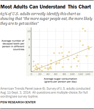
It is also important to keep in mind that visualizations are not intuitive. Therefore, they should be simple and easy to interpret. In Albert Cairo’s book, he points to a survey published by the Pew Research Center that tested U.S. citizen’s knowledge of basic science. They found that 4 out of 10 people in the survey could not correctly interpret the scatterplot below.
As a clinical informatics physician, I often do not have worry about my audience of C-suite executives or other medical professionals not having the knowledge of interpreting graphs or plots. However, that does not make us immune to not being mislead by improperly designed visuals.
For fun! Here is a link to a data visualization project I completed for one of my master’s classes – https://awindham.shinyapps.io/Project2/.

One thought on “Data Viz”